
Kitchen trends move fast, but the best colour decisions are the ones that still feel right five (or ten) years from now. For 2026, the strongest direction isn’t “one hero colour” so much as layered, liveable combinations, warm whites with soft tonal contrast, nature-led greens and blues, richer timber notes, and tactile surfaces that feel less glossy and more grounded.
At Precision Cabinets, we design kitchens for real homes across the Perth metro and South West, with custom cabinetry and benchtops tailored to each space. That matters because colour trends look different in WA light (often bright and crisp), and because a kitchen isn’t a single colour, it’s a set of decisions across cabinets, benchtops, splashbacks, handles, flooring and wall paint.
Below is a practical, 2026-focused guide you can use to choose colours that feel current and cohesive.
What’s shaping 2026 kitchen colour choices in Australia
1) Softer palettes with a “calm, airy” base
One of the clearest signals for 2026 is a return to lighter, more ethereal colour families; think softened whites, silvery neutrals and muted pastels that still read sophisticated rather than “baby”. Dulux’s Colour Forecast 2026 (built on Australian trend research) strongly reflects this direction.
How this shows up in kitchens:
- Cabinets lean warm-white, greige, putty and pale mushroom rather than stark white.
- Benchtops go lighter (creamy stone looks, gentle veining, matte finishes).
- Splashbacks shift from high-contrast subway tile to tonal, textured surfaces.
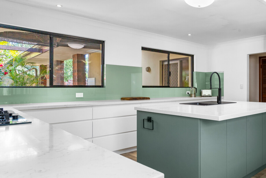
2) Nature-led greens and blues (but not overly saturated)
Green has been around for a few years, but 2026 refines it: less “emerald statement”, more olive, eucalyptus, sage, blue-green and “dusty coastal” tones. Kinsman’s 2026 trend reporting also leans into warm, organic palettes and softer shapes, reinforcing that this isn’t a short-lived spike.
3) Material reality: engineered stone rules have changed
Benchtop choices in Australia now come with an important compliance lens. Safe Work Australia notes WHS ministers agreed to ban engineered stone from 1 July 2024, with legal implementation handled by jurisdictions. The Australian Government also summarises the ban and clarifies that it doesn’t apply to alternatives like porcelain and sintered stone.
Why this matters for colour trends:
Some of the “classic engineered stone looks” are being replicated in newer categories (porcelain/sintered/mineral surfaces, and updated laminates). So 2026 trends aren’t just about colour, they’re about choosing the right finish in the right material family.
2026 trend combinations you can actually build around
When planning a trend-forward kitchen, the key is structure – not guesswork. The most successful designs start with one strong anchor (usually the cabinetry), then layer the benchtop and splashback to complement and elevate it.
Whether you’re designing a brand-new space or planning a kitchen renovation, choosing your colours as a coordinated combination, rather than three separate decisions, ensures the final result feels cohesive, balanced and timeless.
Instead of chasing bold standalone colours, 2026 trends focus on harmonious palettes that work together through tone, texture and material contrast. Start with your dominant cabinet colour, then select a benchtop that either softens or sharpens that tone. Finally, introduce a splashback that adds subtle depth without overpowering the space.
The combinations below reflect colour directions that are not only on-trend for 2026, but practical, liveable and well-suited to modern Australian homes.
Quick reference table: 2026 colour directions (cabinet + benchtop + splashback)
| 2026 direction | Cabinet colour | Benchtop look | Splashback idea | Hardware notes | Best for |
|---|---|---|---|---|---|
| Soft-warm neutrals | Warm white / putty / greige | Light stone-look with subtle veining | Same-tone porcelain slab or micro-textured tile | Brushed nickel or soft brass | Bright WA kitchens, timeless updates |
| Olive + natural timber | Olive / sage lowers, timber uppers | Creamy mineral/porcelain surface | Handmade-look off-white tile or stone slab | Aged brass or black | Family kitchens, coastal/organic |
| Moody modern contrast | Deep charcoal / inky blue | Mid-grey concrete look | Full-height slab (stone-look) | Matte black | Contemporary renovations, open-plan |
| Coastal blue-greens | Dusty teal / blue-grey | Soft white surface | Rippled/kitkat tile in tonal shades | Brushed nickel | Hamptons/coastal homes |
| Earthy reds + clay accents | Mushroom cabinets with clay feature | Warm off-white | Terracotta-toned tile or warm neutral slab | Bronze/brass | Warmth without going “dark” |
| Statement timber grain | Timber-look joinery feature | Calm, plain light surface | Minimal grout tile or slab | Keep hardware minimal | Elevated, design-led homes |
Tip: If you’re presenting options in the showroom, keep the “cabinet + top + splash” samples together so clients judge them as a set, not in isolation.
Cabinets: what’s trending in 2026
Warm whites replace stark whites
Stark “paper white” cabinetry can look harsh in strong daylight. In 2026, warm whites and creamy off-whites feel more premium and forgiving, especially with textured finishes and softer edge profiles.
Pairing advice
- Warm-white cabinets + light veined benchtop = crisp but not clinical.
- Warm-white cabinets + timber accents = instant warmth without going beige-heavy.
Two-tone kitchens (done more subtly)
Two-tone isn’t disappearing, it’s evolving. Instead of a bold colour-block, 2026 two-tone tends to be:
- Darker lowers + lighter uppers, but in muted hues (olive, blue-grey, charcoal).
- Tall cabinetry matching walls, with an island in a slightly deeper tone.
Precision Cabinets’ custom design approach allows proportions to be carefully considered, ensuring two-tone kitchen cabinets feel intentional and balanced rather than overwhelming.
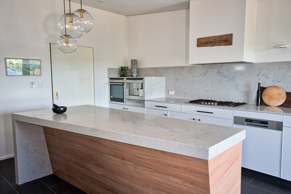
Timber tones are “back” (but cleaner and calmer)
Rather than orange-stained timber, the direction is:
- White oak / light oak looks
- Walnut-inspired richness in smaller doses
- Feature panels on islands or appliance towers
A related global signal is the renewed interest in richly patterned woods (like burl) in 2026 cabinetry conversations, reflecting the move away from flat, sterile finishes. (Use this as inspiration, but keep local availability and budget in mind.)
Benchtops: 2026 colour direction + what to consider post-2024

Lighter surfaces still dominate (with softer pattern)
Even as cabinetry becomes warmer or moodier, benchtops often stay lighter to keep the kitchen bright and spacious.
What’s “in” for 2026
- Gentle marble-inspired veining (not high-contrast)
- Soft clouded whites
- Light concrete looks with warmth (greige rather than icy grey)
If you’re steering clients toward Caesarstone-style aesthetics, note their catalogue now includes mineral and porcelain categories with “new” collections highlighted. (Specific colours vary, but the broader direction, light neutrals, soft veining, concrete looks, tracks clearly.)
Dark benchtops are niche but strong (when paired right)
Dark kitchen benchtops (charcoal/black) look best when:
- There’s plenty of natural light
- Cabinetry is lighter or timber-led
- Splashback is simplified (slab or low-contrast tile)
- Fingerprint/maintenance expectations are set early
Splashbacks: the easiest place to add trend without regret
If a client wants “something current” but fears commitment, splashbacks are your best lever.
Full-height slab splashbacks are still rising
The “one continuous surface” look remains popular because it’s:
- Cleaner visually
- Easier to wipe down (less grout)
- Great for open-plan kitchens
Texture is the new feature
In 2026, colour statements often come from texture, not loud tones:
- Kitkat/stacked tiles in tonal shades
- Micro-textured ceramics
- Gentle ripples, handmade edges, matte glazes
Colour direction: tonal, not contrast
Instead of white cabinets + black splashback, you’ll see:
- Greige cabinets + warm off-white splash
- Olive cabinets + creamy splash
- Charcoal cabinets + smoky grey splash
How to choose a 2026 scheme that won’t date quickly
Step 1: Decide what must be timeless
For most homes, that’s:
- Main cabinetry colour (or at least the bulk of it)
- Benchtop tone (light vs mid vs dark)
Step 2: Add “trend” in a reversible layer
Use trend-forward choices in:
- Splashback tile colour/texture
- Handles
- Feature cabinetry (island, bar nook, overheads)
Step 3: Test under WA lighting
A colour that looks perfect in a showroom can shift at home. Encourage clients to view samples:
- Morning and late afternoon
- With flooring sample nearby
- Beside a paint swatch (even if they’re not repainting)
2026-ready colour combos
- Warm white cabinets + creamy veined benchtop + tonal textured splashback
Clean, bright, and very safe – ideal for renovations where resale matters. - Olive lowers + warm white uppers + light benchtop + handmade-look off-white tile
On-trend without being loud; suits Perth’s indoor-outdoor lifestyle. - Charcoal cabinets + light concrete-look benchtop + slab splashback
Modern and architectural; keep lighting strong and finishes matte. - Timber feature island + warm neutral perimeter cabinets + plain light benchtop
This is a “designer” look that still feels calm.
Ready to Choose the Right Colours for Your Kitchen?
Selecting the perfect combination of cabinet colour, benchtop surface and splashback finish can completely transform the look and feel of your kitchen. At Precision Cabinets, we help bring all the elements together – ensuring your materials, tones and textures work as one cohesive design.
Whether you’re planning a full renovation or refreshing your existing space, our team can guide you through colour selections, finishes and layout considerations to create a kitchen that feels timeless and tailored to your home.
Contact us today to discuss your project or book a consultation with our design team.